With the heat map you will be able to see the whole summary of your risks, choose to see them as inherent risks, residual risks or combined risks and you will also be able to know how many risks you have in each quadrant.
How to visualize the heat map?
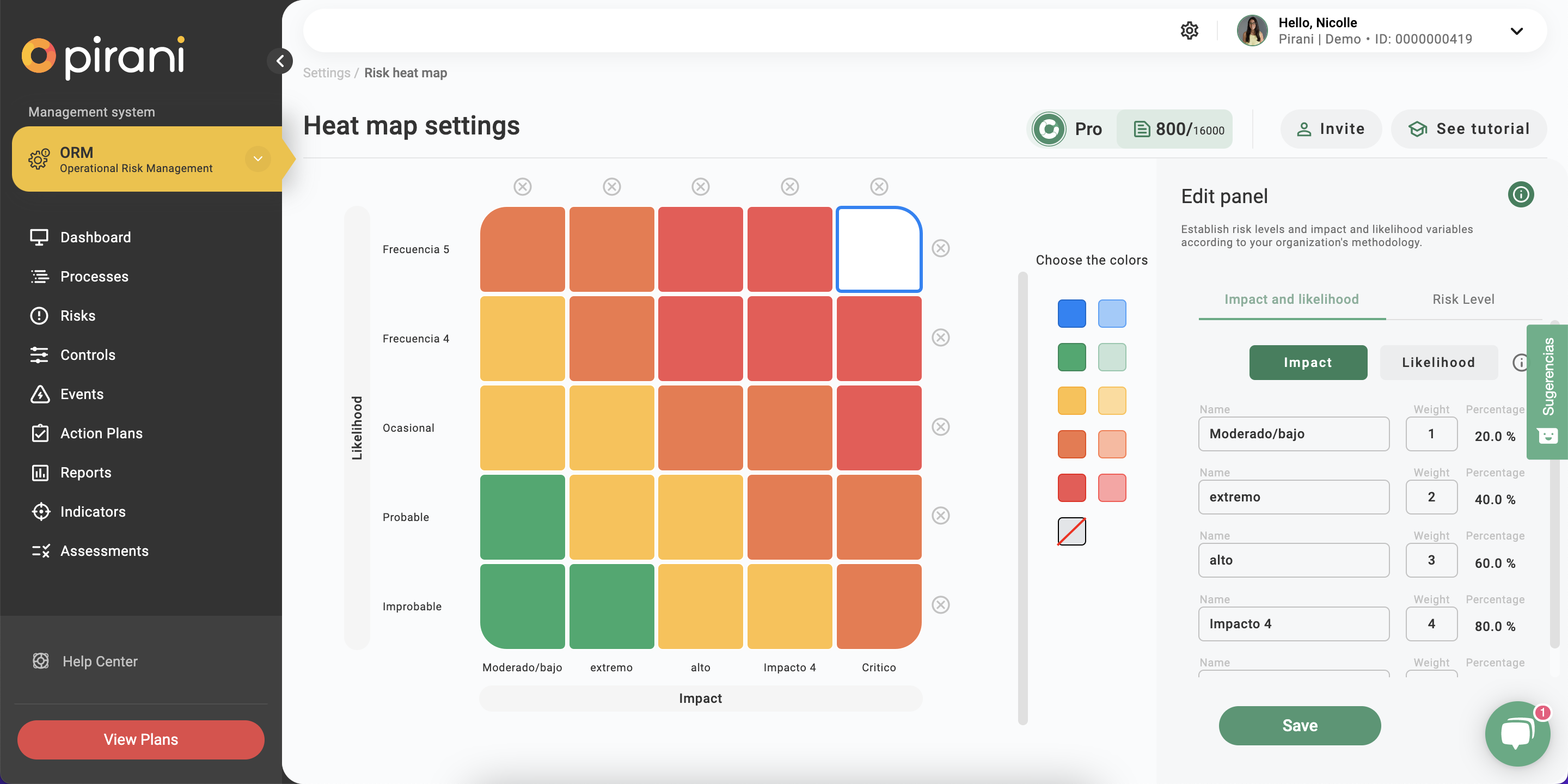
In the Pirani sidebar you will find the "Parameterization" section, click on the "Heat map" section.
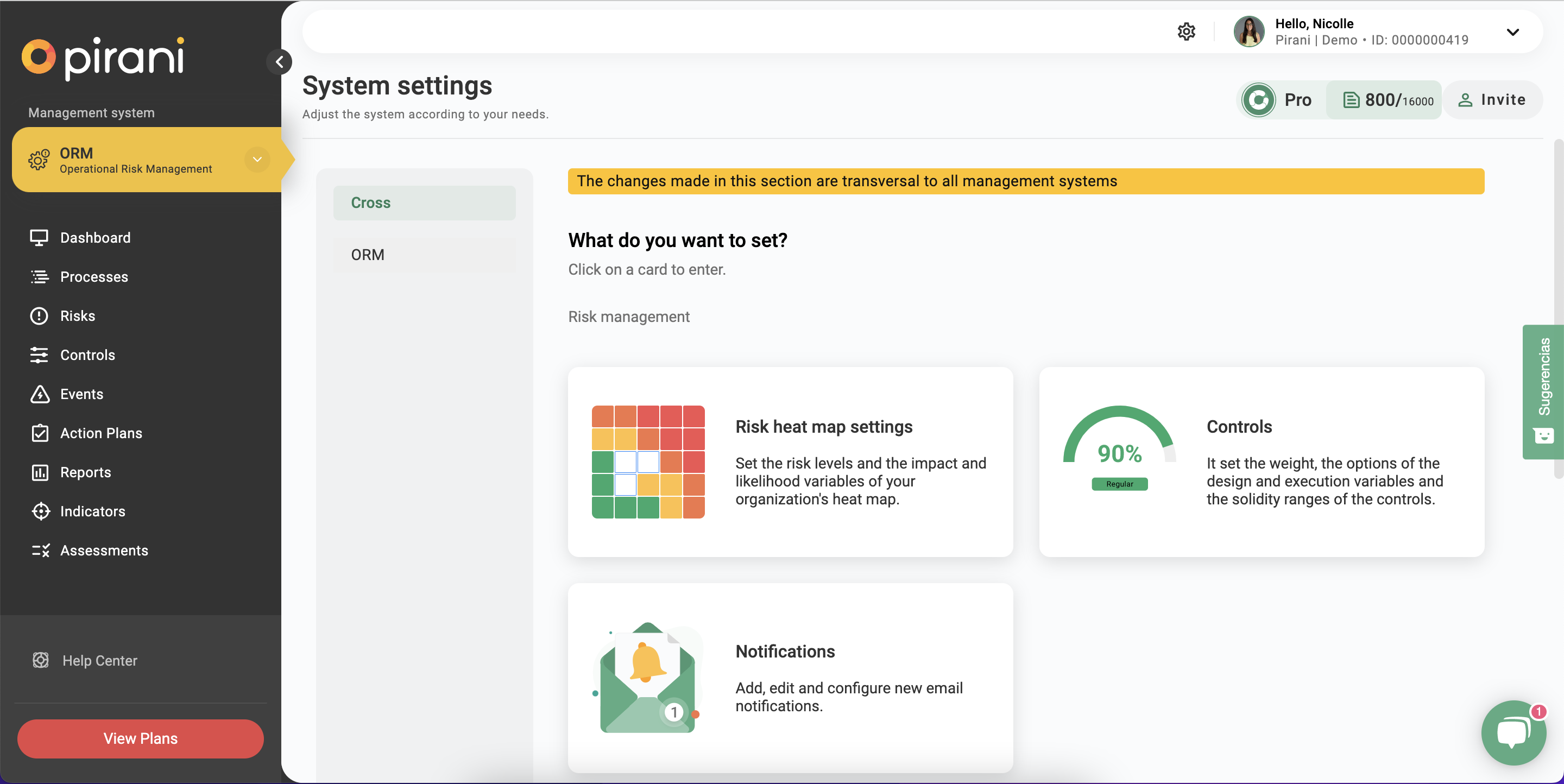
What can you parameterize?
Add impact and probability levels
In the "Add" button you could add if you wish other impact and probability levels. You will always have the option to remove it by clicking on the "x" above each row or column.
Changing the name and weight of impact and probability
On the right side you will have two tabs, click on "Impact and Probability" and it will give you the option to change the default names and weights in the tool, modify it according to your organization's methodology!
Change the name of the risk level
Next to the "Impact and probability" tab you will find the "Risk level" option, here you can change the name of the levels.
Change the color of the levels
When you click on a quadrant you will see on the right side the option to change the color, you can apply it to that quadrant or to all the quadrants that have the same level.